During our time at Bett last week, we had the pleasure of attending Fil McIntyre’s accessibility talk: Practical steps to engage more learners. In just 20 minutes, Fil covered the basics of using assistive technology to improve accessibility in the classroom and he inspired us to deepen our consideration of what it means for a resource to be accessible.
Why is accessibility important?
Firstly, accessibility helps to level the playing field for students with disability. A huge misconception is that disabled individuals make up an insignificant minority in the population. However, in the UK alone, it is estimated that over 350 thousand children have a learning disability, roughly 25 thousand have a vision impairment, and about 25 thousand are hard of hearing. And of course, there are many disabilities that affect learning outside of these three categories. Without accessible accommodations, it is estimated that approximately 10% of children lose out on the opportunity to fulfil their academic potential. This doesn’t include undiagnosed or undisclosed disability, so the figure is likely a lot higher!
People often think of educational accessibility as only assisting children with disabilities, but accessibility can benefit all learners. For example, assistive technology such as captions and transcripts can improve focus and retention, and they can allow students to engage with content outside their language or culture, thus broadening the resources that are available to them. Furthermore, captions can provide accessibility to students in a loud or unstable home environment. Another example of this is voice-to-type technology – although it is invaluable to people with physical disabilities, it can also be ultilised by able-bodied individuals who don’t have the time or circumstance to sit down and write notes.
In a nutshell, accessibility helps to improve engagement, retention and achievement for all learners, so it is a vital consideration when creating educational resources.
How can I improve the accessibility of my resources?
While assistive technology allows a wider range of students to access pre-existing resources, it is important to make resources accessible from the get-go. This is something that Fil managed to perfectly encapsulate in his summarising statement: “Technology can’t make the inaccessible accessible”.
There are a multitude of ways you can enhance your content to include diverse learners, but SCULPT is a good place to start. Created by Helen Wilson, Worcestershire County Council, the acronym encompasses six fundamental features of an accessible resource.

Structure
The majority of learners are able to visually scan a document and physically scroll to the section that is most relevant to their learning. However, students with vision impairments or physical disabilities may need to use a screen reader to both read the content and navigate to the appropriate section.
One great feature of screen readers is their ability to simulate a navigation menu of distinct sections within a document when you apply a heading structure. This makes it easier for students using such assistive technology to navigate the document and find the relevant information. (Headings are standard for HTML and also available as a function in Microsoft Word’s toolbar.)
When integrating a heading structure into your content, don’t choose headings by size. Instead, choose headings by their hierarchy in the context of the content:
Heading 1
This can be thought of as the title of a book. It is only used once, it describes what the content is about, and it starts just above the main content.
Heading 2
This heading style should be used like the chapters in a book. It should be used to describe the main topics discussed in the document.
Heading 3
This is used for smaller sub-sections within the ‘chapters’.
Common mistakes:
- Using heading formatting to emphasise bold or big text. Heading formatting should only be used for headings. If you want text to stand out, manually change the colour, size or weight.
- Exclusively using one type of heading throughout a document in an attempt to maintain style consistency. This will make it difficult for students to differentiate between the hierarchy of different sections and sub-sections.
Colour contrast
There are many reasons why a student may struggle to understand content with a low level of contrast between the text and background. The readability of low contrast content can be significantly affected by factors such as light (e.g. the sun’s glare), tiredness, and varying degrees of colour blindness (which affects approximately 4.5% of the population). Increasing colour contrast allows more people to access your content in more contexts.
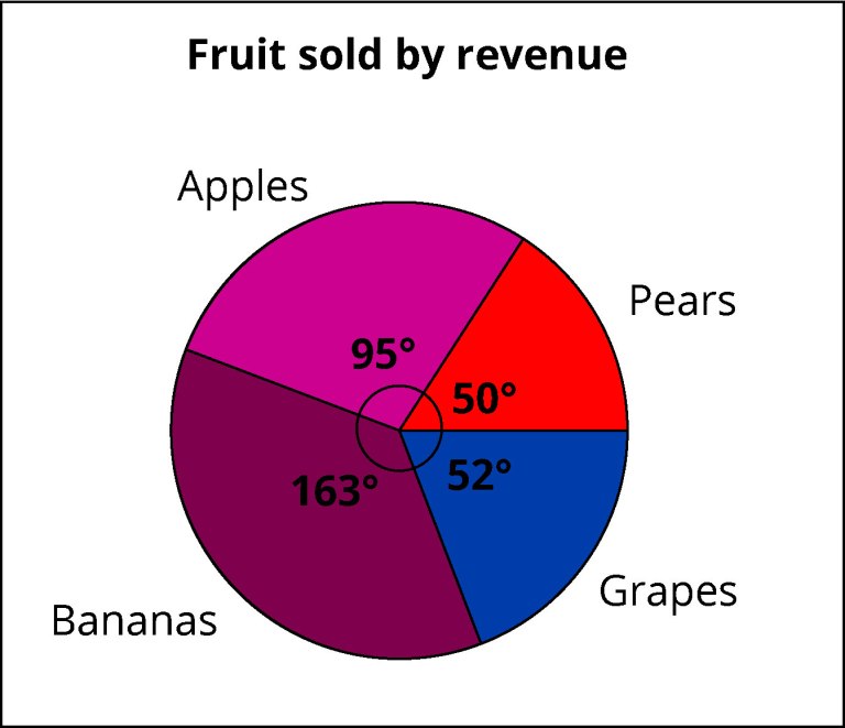
- Sections all fairly dark; little contrast between them
- Dark text on dark colour makes it hard to distinguish.
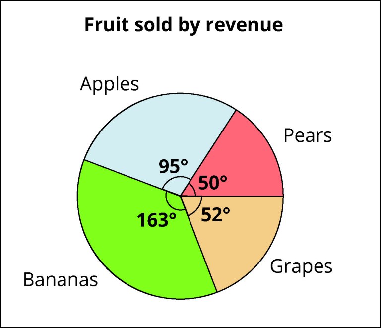
- Better contrast between sections and text.
- Angle markers more clearly defined.
As well as increasing colour contrast, it is important to avoid using colour as the only distinguishing factor in diagrams and images. Always include written labels and/or patterns as an additional descriptor.
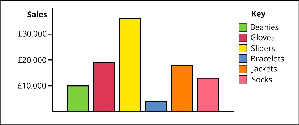
- Colour used as the only distinguishing factor in the key.
- Colours are all fairly similar contrasts.
- No requirement for being able to distinguish colours.
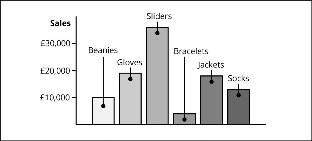
- Sections are labelled directly, so no room for confusion.
Use of images
Images can enhance your content and allow learners to deepen their understanding of difficult concepts. However, diagrammatic explanation is not always accessible to students, especially for those with visual impairments. This is why it’s important to always include alt text with your images.
Writing effective alt text is relatively simple. It should be specific and concise, without repetition or overly decorative language, and it should include any essential text or data that’s part of the visual image. That last point is particularly important as screen readers cannot read text contained within an image. This means that you should never use an image instead of text as students may miss out on important information.
When creating educational content, it is important to only use images that support the textual information. Decorative images can be confusing for students using assistive technology, such as screen readers, as they make content ‘noisy’. Decorative content also includes elements such as borders, line breaks and brand graphics.
Common mistakes:
- Including finer and less relevant details in alt text, such that the description becomes long and unwieldly. If the colour of somebody’s clothes or the height of a building don’t matter, then you don’t need to mention them.
- Giving away the answer to a question in the alt text. This one is particularly important in STEM educational resources, such as what we work on at Orso Publishing, where it is often the case that a question requires the student to deduce information about an image themselves. In these cases, care must be taken to describe the image accurately and concisely, and in a way that allows the solution to be found but without giving it away.
Links
Another important feature of screen readers is the ability to compile hyperlinks into a list, much like the heading navigation menu. When displayed in a list format, links are out of context and often placed in alphabetical order, so there are some definite Dos and Don’ts when adding links to your content:
Do
- Clearly identify and describe the target of the link.
- Keep link text concise. Screen readers can skip sections of normal text, but they are forced to read the entirety of link text.
- Restrict the number of links you use. Using too many unnecessary links can make it difficult for a screen reader user to navigate the page.
Don’t
- Use the phrases ‘Click here’ or ‘Find out more’. Out of context, this gives the user no indication of where the link will take them.
- Use the full web address. URLs are usually a long string of nonsense letters and symbols, which makes it very difficult for the user to understand the target of the link.
- Capitalise your link. Some screen readers read capitalised text letter-by-letter, which can make things very confusing for the user.
Plain English
This feels like an obvious one, but it can be difficult to implement in educational texts where the use of subject-specific jargon is often necessary.
In general, you should aim to:
- Use short everyday words in the place of formal language.
- Be specific and avoid cultural idioms.
- Write for your audience and define any acronyms or scientific language.
- Trial your content with typical users and implement any feedback. What might seem simple to you could be confusing to others.
Tables
This is another consideration that should be made with users of screen readers in mind.
Because of the way screen readers read tables, you should only ever use them to display data, and avoid, if possible, using them simply to improve the aesthetics of your content. Screen readers move horizontally along each row, reading both the column header and the content of each cell. This means it’s really important to label column headers with clear titles and not leave any blank cells (aside from adding to confusion, blank cells can mislead screen readers into assuming there is no more content in the table and so students may miss out on vital information).
In addition to this, merged cells, split cells, and nested tables all pose a risk of confusing the user as the screen reader struggles to navigate the complicated table structure. In general, tables should be displayed in a way that you are able to logically toggle to each cell using only the up/down/left/right arrow keys on your keyboard.
This is by no means a comprehensive list of all the ways you can support every type of learner, however, we hope it has given you some ideas of how you can adapt your content to include a wider range of students. If you are interested in exploring a more extensive list of best practices, the University of Hull has developed a ‘practical guide to designing content for a diverse set of learners’.
And remember, technology can’t make the inaccessible accessible, so ensure that you make conscious style decisions to accommodate a diverse set of learners.
Subscribe to updates
Like what you read? Sign up for news and updates like this.